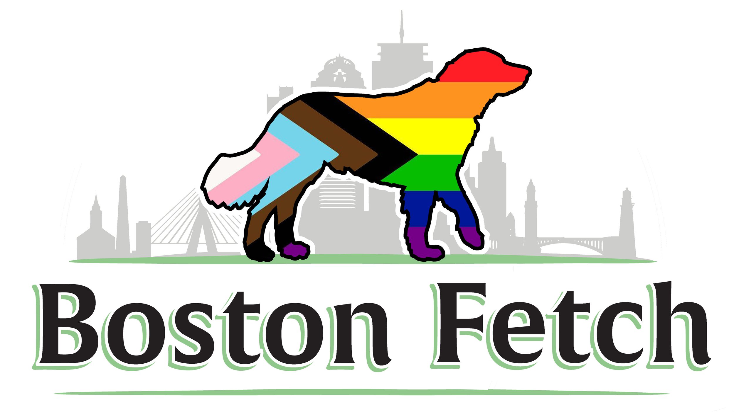
The Smith Logo
The final product
We always knew we wanted to integrate Smith into our logo, since he’s basically the founder of the company. The question was how to capture his ‘dogness’ and what kind of company we want to be. So we enlisted the fine people at Best Dressed Signs (also a local JP business!), and got to work.
Nose forward…
Best Dressed Signs did a great job recreating Smith, after bombarding them with a million images and videos (sorry!). The idea is that he’s alert, moving forward, but relaxed and down for whatever, ideally like us.
We are a local biz
The next step was to make it clear to everyone that we are a Boston company through and through, and we thought the best way to do that was to add our distinctive skyline.
Classic lettering
We wanted our lettering to be bold yet classic, and to add some depth. Josh was awesome at making everything stand out but also integrating the lettering into the overall scheme.
What do we do?
Finally we wanted to make it clear what our business actually was, and to bring it all together. Thanks again to Best Dressed Signs and Josh, they made it all happen.


